Ernest Burden III
O'Really inc.
PRODUCING A DIGITAL / WATERCOLOR HYBRID
ARCHITECTURAL RENDERING

Here is an overview of the process as done on a few of my recent renderings. I am not listing each and every step because I am targeting this to professionals who will already be familiar with most if not all aspects of this process. It's just the assembling of these that is new. Also, I am focusing almost entirely on the computer portion of this hybrid technique. The other portion, traditional watercolor painting, is something you should already have some familiarity with. Watercolor is well covered in numerous books and web-based tutorials.
Background
I began my rendering business in 1984 after working as the assistant to render Brian Burr. Initially, I did all layouts by hand using the classical projection method. In 1987 I began using a CAD product called Datacad to model the projects I was hired to draw and had it generate my perspectives. These were transferred to illustration board by 'pinning'. A printout was taped to the board and a push-pin was used to mark through the end-points of every line, which was then drafted onto the board in pencil in a connect-the-dots fashion. I believe it was my artist sister, Analisa, who declared the pin method to be a complete waste of time, forcing me to figure out how to use a pen plotter and medium gray waterproof ink to get Datacad to draw the line perspective right onto the final paper with perfect accuracy and lines that looked like pencil. The rendering was then completed with traditional media, at first airbrush and colored-pencil, and later looser watercolor.
All along I was experimenting with computer rendering software, but was never very satisfied with the results. The images were rarely as good as any decent artist could do by hand. At that time one of the biggest reasons to do computer art was so you could say you did computer art. I experimented by re-doing some renderings that I had done by hand with a rendering software called Renderize, but never got an image as good as my hand-painted ones.
What I recognized was that there were aspects of an image that I could do so much more quickly and easily in a digital rendering, but there were other aspects that were extremely hard to do in the computer that I could do in a short time with a pencil or brush. I decided to combine the two methods in an effort to create a new type of image, a digital/traditional hybrid. I hoped to combine the strengths of both and by-pass the weaknesses.
Keeping in mind that the end product is a commercial illustration, I have no concerns about maintaining a fine-art aura of traditional painting. I'll save that for other work.
The last piece of the puzzle for making this method work was a good CMYK inkjet printer to output the computer image in my studio. This was important because I rarely have the time to get images output by a service bureau.
When on a deadline you are as likely to need to output an image at 2AM as 2PM, so having all aspects of your production process available in-studio is very important. I was hired to do a series of interior renderings in a hurry. This is perfect work for computer imaging because it is too time-consuming to draw lots of office furniture arranged throughout a space, but in CAD it is a breeze to do, including doing fabric colors, complex shadows, etc. On my way back to my studio from picking up the assignment I stopped in at a computer store and bought my first Epson Stylus Pro printer. I did a "pretty good" digital rendering, printed it out and spent a few hours coloring over it with pencils, softening the otherwise harsh image, correcting lighting, adding a few entourage items. 24 hours later I was back in my clients office with a final rendering, the first of several dozen in the following few months. Who needs a net?
More recently, I have tried to push this method much farther by using Photoshop to modify the digital image and add many elements and effects that I would have done by hand. Photoshop is also critical for combining all the various elements I use to assemble the image before printing. While this working method does sometimes save time, the main reason is for the challenge of it. I have been modeling, drawing and painting buildings every workday for twenty years. I was looking for anything to make the seem new and interesting. Creating new working methods does that.
 will maintain the detail perfectly if you use a high dpi-equivalent (it goes up to 4000dpi). It will also maintain the size you set, so if you are printing to a height of 16", the PDF file will import into Illustrator of Photoshop at that size. The linework must be sized in PS to lay over the computer image. If you matched the 'cameras' in the CAD and rendering software they will line up as perfectly as can be. In the CAD software you can assign an overshoot factor to some or all of the lines, creating an effect of hand-drafted im-perfection. I also often use a third-party filter called Jiggle, available in a set called AlienSkin EyeCandy, to add a slight waviness to the linework and also the lower layers, also re-creating the soft-edged hand look, but within Photoshop. Linework can be transferred via PDF files in color and in multiple files which will import in perfect registration. I use this to adjust the color or darkness of linework, like mullions being dark while joints are less so. It is hard to show some of these things in images that will fit on a website. The original files typically are sized around 4000 pixels high or wide, some to 5K or 6K if I need to print them large and keep detail. However, working that big in Photoshop with many layers taxes even a fast, loaded computer, and there is only so much you will get out of any printer.
entourage
 Entourage items like people and cars and trees (if they are prominent) can be drawn by hand, scanned and dropped into the Photoshop file. A new layer under the scan can be used to draw in a solid mask for the figures. This can be quicker than cutting around the figures, but either will work. I like to make the linework layers in the "darken" or occasionally "multiply" mode. That is much easier than trying to delete the white areas, but again, that works, too.
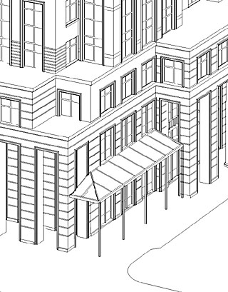
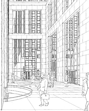 At left is a final linework example, with entourage layered on.
In Photoshop you can also import and drop in images onto signs, client logos, etc. Using the 'transform' tools will allow you to position these elements and make them fit in perfect size and perspective. Work on layers and flatten them down later if you need to keep the file size reasonable.
The entourage can be done by an interesting method using a new twist on the old non-photo blue process those of us older than a space shuttle will remember.
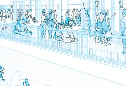 I will print out either my CAD linework or a computer rendering from a PS file set to CMYK mode. By erasing the Cyan ,Magenta and blacK channels you are left with just Cyan, a.k.a. non-photo blue. Printing this out you can draw over it with non-photo blue Prismacolor pencils to layout things, and then draw them in pen or pencil. Scan that in CMYK mode and use PS to remove the cyan, leaving just your hand-drawn lines.
rendering
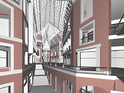 I use Lightscape for my digital renderings. It is a very good program with a very architectural feel. It has no trouble doing proper two-point, panned perspectives, while so many other CAD and rendering software sold to architects cannot do this most basic and important of view construction. Lightscape has two "phases", the first is for preparing the model. While it does not produce photographic renderings, this phase is perfect for doing view studies. It works in OpenGL to allow real-time movement within a model. Although not shown in this example, you can use mapping of polygons including alpha-channel transparency even in this "prep" stage, so the display is quite useful.
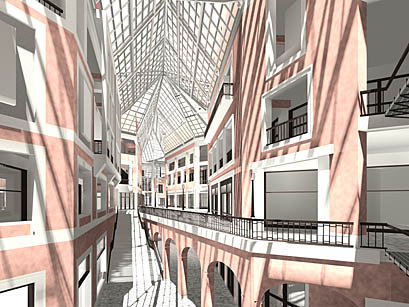 Once I have sent the model into the "radiosity solution" phase I can add sunlight and/or interior lighting, calculate shadows and reflection, and render out the final image to a high-res TIF file.
 It can be very helpful to use some limited texture mapping when doing the digital rendering. An example would be to put a basic map onto the windows of a building. You can adjust the size of the map to fit the size of the model so that when you do the rendering the windows will come with a complete beginning paint application. It is simple to paint on variations, darker areas, etc., but having all the glass toned is a great time-saver, and in this example I use a hand-painted texture, so it avoids a 'machine' look.
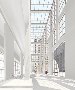 As good as Lightscape is as a lighting renderer, the images have a tendency to be a bit dull. They may look very gray. In PS I will use Hue/Saturation to find the color hiding in the image. By pulling the saturation up to 100 and then working backwards you can find a comfortable level. You will reveal color banding as you saturate, but since I will paint over the image, this is not fatal.
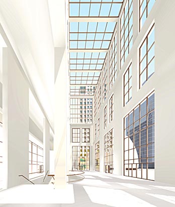
Masking
Once you have a digital rendering with all the variations of tone and texture, it is extremely hard to isolate and modify partial areas. One very good solution is the use of a mask rendering. Back in Lightscape's 'prep' stage, I quickly modify all the different material definitions so that each is a unique, opaque color.
 It doesn't matter what color, just so each is distinct. I use LS's flat "un-enhanced" display mode to re-render from the same camera as the regular rendering, and to the exact same resolution. Most rendering software has some version of flat, ungraded shading. Just be sure to turn off any anti-aliasing.
 This new image will load right into Photoshop as a new layer in perfect registration (assuming you have not yet done any cropping of the original TIF rendering).
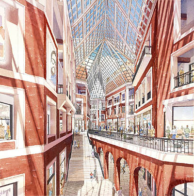
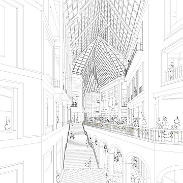
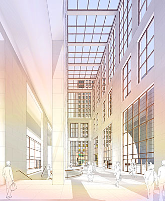
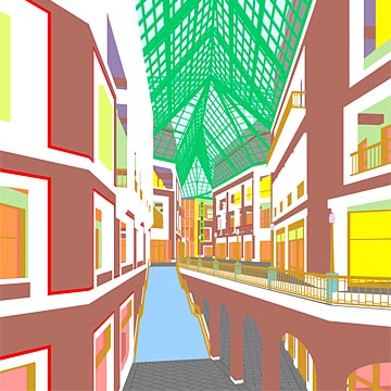 Now, this layer can be made active and a material selected with the magic wand >non-contiguous>tolerance of 0 or 1 to instantly select every pixel in the image that is, say, the brick. Turn off the mask layer and make the rendering layer active and you can adjust lighting, color, saturation, etc. for just the brick. In the example at the left, I used this method to select a mask for the sky area seen through the skylight so I could drop in a sky image (as seen in the final) scanned off another rendering. That sure is easier than painting in a sky, especially if you mask it by hand.
Underpainting
While the practice of underpainting a watercolor is far from new, it was renderer Tom Schaller who nudged me to begin to use it by demonstrating how he does it in his first book. Since then I have gone from very timid use of colored underpainting to very strong, rainbow-colored applications. The use of an underpainting makes doing a watercolor rendering so much easier than one attempted without it. It provides a unifying base to all later washes and allows those washes to be done in a quicker, more loose style without giving up on subtle variations in color temperature. The only downside is that the underpainting will cost you your whites anywhere that it is very heavy. But if color is what you are striving for, pour on the underpainting.
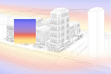 I began to wonder if I could do a decent underpainting in Photoshop. While it must be printed in CMYK, I found that I could still get very good results, and faster. Also, working in Photoshop I can try different configurations and strengths on screen.
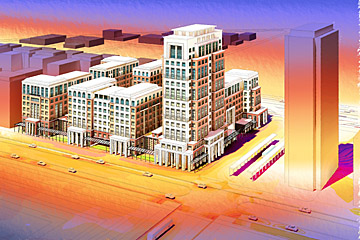 The top image shows the gradients with their layers at full strength, the bottom as used in the final print.
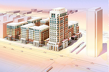
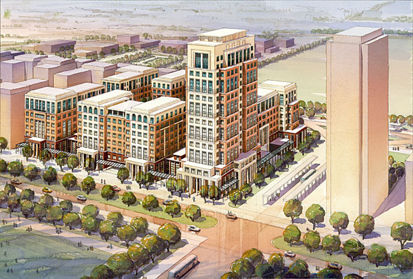
Note that once you paint in background stuff, street color, trees, etc. much of this color is not noticeable. But it is there, making the whole picture more dynamic and colorful. On this picture I chose to keep the underpainting off the subject building to keep the light stone light.
Here the underpainting is used to mitigate the height of the space by cooling down the color as it rises, the foreground colors lead the eye into the space, while the warm area on the left pier brings some life to a part of the image that would otherwise feel dark and un-inviting.
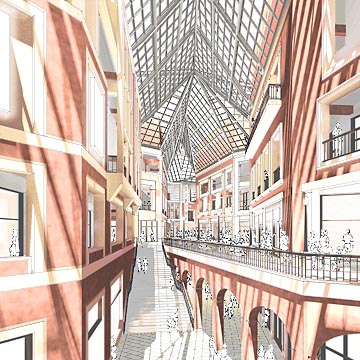
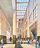
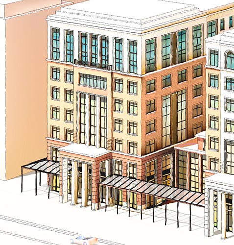
Here is a near-final image above, still in Photoshop, showing the digital rendering after adjustments including a major brightening of the shop interiors and satiration and color enhancements in the stone material.
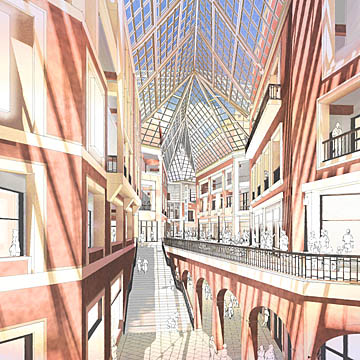
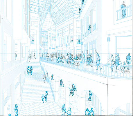
Below it has recieved its sky, dropped into a masked area. The underpainting on this rendering was done less strong than others to avoid over-darkening the edges. Also, because this is a very complicated space I felt it needed a fairly clear presentation for the whole image to be readable.
Ready
to print
The image will be output to an Epson 3000 using Lysonic E archival inks. This printer operates up to 1440 x 720 dpi in CMYK. (Note that you should work in Photoshop in RGB because the drivers for these type of printers work in RGB). Typically I print in 720 x 720 dpi mode, as there is little visible difference but the print gets done faster. I print onto Arches watercolor paper, either 90 lb. or 140 lb. Yes, the printer can handle 140 lb. paper, though it is harder to load. The paper-path is fairly straight if you manually feed the paper from the back of the printer.
I don't bother trying to stay fully traditional with how I prepare the paper for watercoloring. Instead of wetting and stretching the paper, I simply glue it to an illustration board. I use a roll of 3M #568 contact tape that comes in sizes of 12" and 16". This stuff is expensive, but worth it, because I don't have to send out my prints to be mounted. I can do it in my studio. You roll out the tape, remove the backing (I use three layers to get a good bond) and lay on the watercolor paper. To get it to really stick, I apply heat and mild pressure. A professional roller press would do this nicely, but I use an iron. Yes, I iron my art. The iron must be dry and set to medium heat, a sheet of white tracing paper over the print will protect it. Test the corners for adhesion.
The printer ink is not completely waterproof when applied to WC paper, so I developed a method to make it so. I found that if it gets wet, it will 'melt' and get down into the paper, becoming permanent. The problem is it will also bleed, especially the Magenta ink and the blacK ink. Also, there will some color shifting. However, I found that if you steam the print the ink sets in well without much/any bleeding and color shift. I accomplish this by holding the print above my tea kettle as it boils away. I make sure that steam get onto all parts, and lots of it. You will notice the colors deepen, saturate, as they are set into the paper. Remember, steam is HOT. You can easily burn your fingers, and then painting is no fun. Next I am going to buy a professional clothes steaming machine (a tank and a hose). That should make this odd procedure easier.
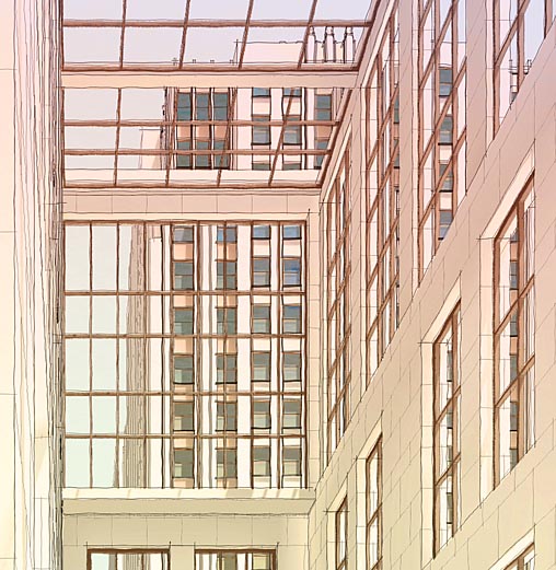
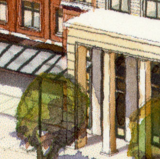 This is a small area of a finished rendering that has been scanned. At full-size you can see some artifacts from the inkjet printing. You can see the cyan dots in a few light areas, but these are not a problem within the context of the whole illustration. Another problem that can show up is in dark areas is a 'deadness' that comes from the black ink. I minimize this by the high level of saturation I add to the original digital rendering in PS, and also by burning in the light areas, in other words, over-brightening the picture, knowing that when I paint the final, a simple wash will restore the darkness level I wanted and with paint, not black ink.
This technique is not perfect, and not for everyone. It is an interesting new way to approach producing a watercolor rendering. In some cases it is not even faster than just painting the picture the old-fashioned way. But sometimes it saves a tremendous amount of time. This has been an important factor in developing the technique as a method for dealing with commissions where the client has high expectations and a low budget. In these cases I feel that using this technique has allowed me to include the levels of detail the client wants while not devoting the time it would take to layout and paint a similar picture by hand. Also, I can print the image fairly large and still get through the watercolor portion quickly because the image is fully toned to begin with. I just use a larger brush.
Finally, I find this new way of working exciting. It is nice to have something new to try after so many years of architectural rendering. I hope you enjoyed this tutorial. Remember also that you can pick-and-choose parts of it to apply as they serve your way of working.
Ernest Burden III
Click to
enlarge